BOMA packaging in a new look: find what you need, faster
Over the coming months, our BOMA products will gradually appear in new packaging. Fresher labels, clearer names and one consistent colour system across the entire range. The goal is simple: you recognise faster what you need, and you know for certain that you have the right product in your hands. We have been working hard on this project together with packaging design agency Blackbirds.
What does this mean for you as a customer?
It is not only the look that changes. As BOMA grows, partly through acquisitions, new products are being added. A number of existing products are getting a different name or an adjusted formula, so that overlapping ranges form one clear line.
- Quality remains assured. Where a formula changes, it is a carefully considered decision. You can keep counting on the same result.
- You will hear about it in time. Is something changing about a product you use? Then we will inform you about it specifically.
- You do not have to do anything now. The switch happens step by step, while existing stock is being used up.
One colour, one meaning
The biggest gain in daily practice lies in colour. In the previous BOMA range, the colour coding had lost its logic over the years. A powerful degreaser carried yellow-orange, while kitchen care carried a slightly different yellow. Red, widely coded in the market as sanitary, also turned up on dishwashing products. Across departments and sectors, the same colour did not always mean the same thing.
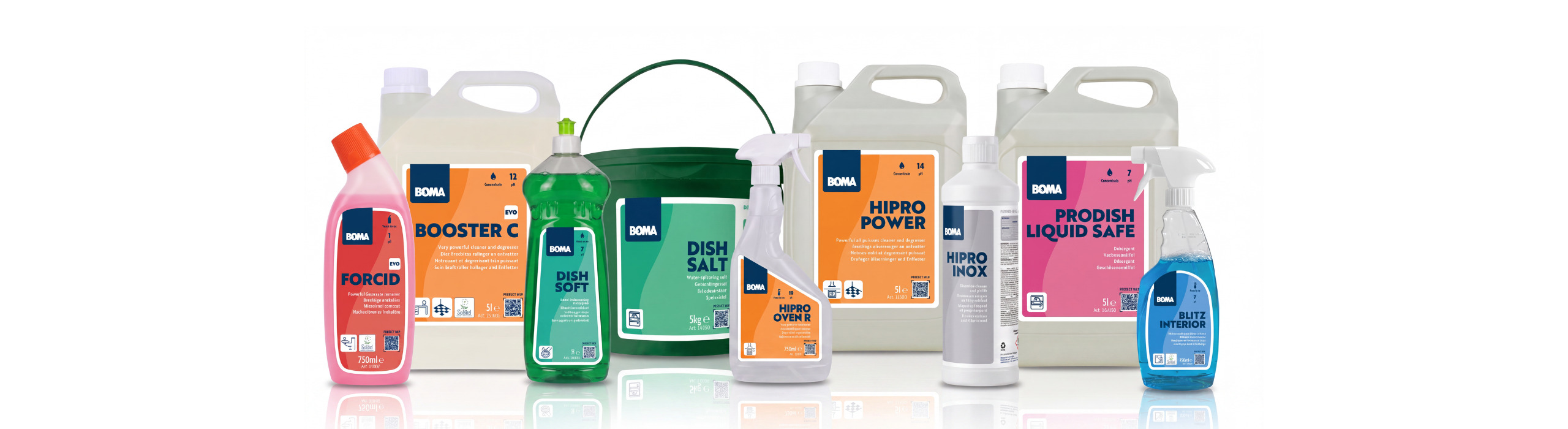
That has now been put right. From now on, every product group has one fixed colour, and that colour means the same thing everywhere: for chemicals, but just as much for paper, cloths and sanitary products. Anyone putting together a trolley, restocking a supply cupboard or training a new colleague no longer has to explain from scratch, product group by product group, what is used for what.
"For the people who work with it every day, colour is not an aesthetic story but a usage story. When you have to work fast, you do not look. You recognise. And when the recognition system contradicts itself, that costs time and creates doubt." Eric Dumortier, Blackbirds
Everything you need is on the front
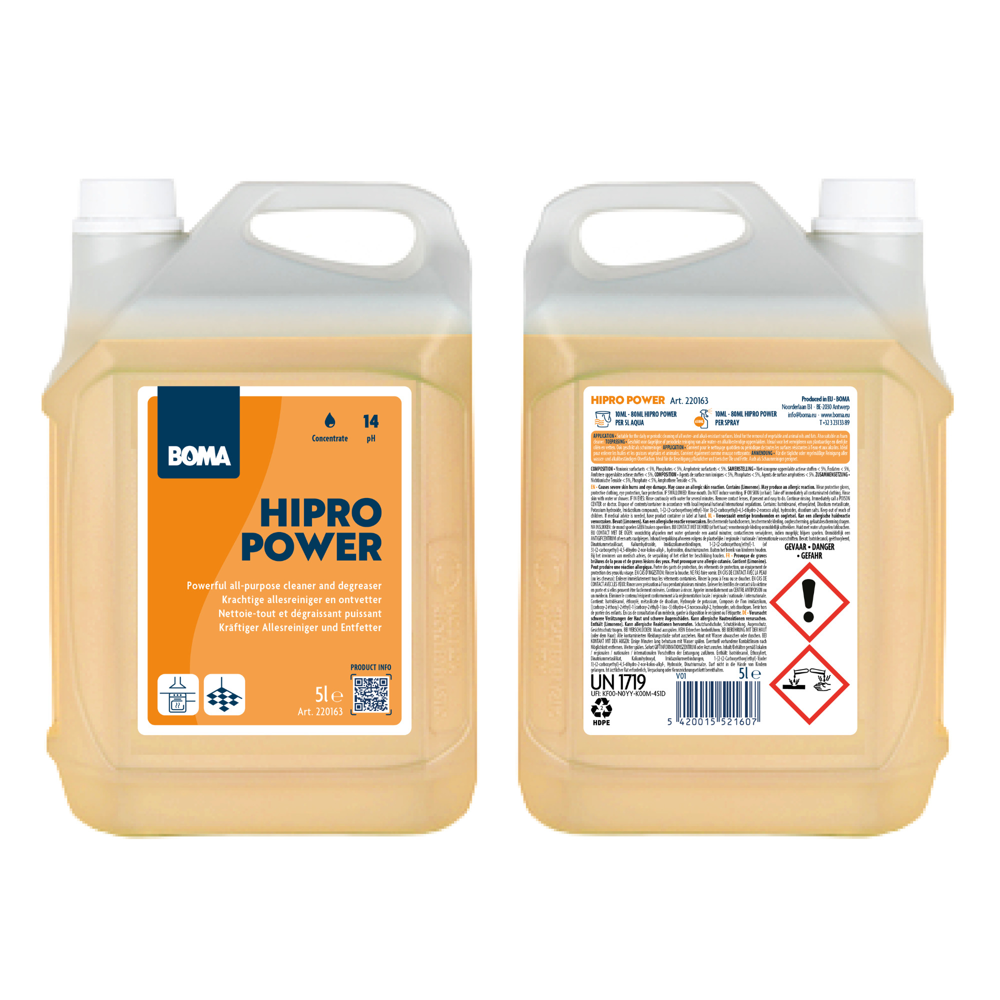
In our market, packaging has to work in poor light, with gloves on, under time pressure, and sometimes for someone who does not read the language on the label easily. That is why the information on the packaging has been rebuilt from the ground up.
- On the front, at a glance. The product colour, the product name and a short subtitle that says what the product does. Alongside that, pictograms showing how you use it: concentrate or ready to use, suitable for floors, number of plies for paper, folding type, dimensions. That information is deliberately on the front, so that the product explains itself.
- On the back, readable instead of legal. Legal texts traditionally appear in the smallest type available. We have made them considerably more readable, because transparency you cannot read is not transparency. The instructions for use are set out concisely in clear colour zones, exactly where you look for them.
- One layer deeper, digital. A QR code on the front takes you to the full product passport on boma.eu: the most up-to-date information, extra languages, usage tips and updates. Handy when you want to know more than fits on the label, or when you work in another language area.
- The same rhythm everywhere. Logo, pictograms and titles are always in exactly the same place, across the entire range. Whether you pick up a pack of tissues or a toilet cleaner: your eye does not have to search again. And in the background of the label you will see the droplet from the BOMA logo return, enlarged into a calm, organic shape.
Why we are doing this now
BOMA has grown strongly in recent years, organically and through acquisitions. Over time, every new product and every new range was given its own design and its own logic. Each one defensible at that moment, but together the coherence had been lost. A thorough harmonisation was needed, including an update of the naming.
On top of that, new European legislation on the packaging and labelling of detergents is on its way. A logical moment to set up our packaging lines to be future-proof straight away, instead of having to adjust everything separately later on.
Understand first, then design
For the design we worked together with Blackbirds, a product and packaging design agency from Antwerp. One striking thing about the process: drawing was deliberately postponed for a long time.
"We first went to look at how cleaning really happens. How are products sold, stored, issued, reordered? What happens in the cleaning trolley, in the cupboard next to the sink, in the five minutes before a room has to be ready?" Eric Dumortier, Blackbirds
Much of that knowledge was already present within the company. BOMA has worked close to the end user for decades and has its own training centres, where customers and cleaning teams are trained in cleaning methods and product use. Alongside the design, a guideline has been built as well: clear rules that give every new product its place in the system. That way the overview is preserved, even as the range continues to grow.
Step by step onto the shelves
We are not converting the entire range in one go. Existing stock is being used up properly, after which the renewed products will make their entrance step by step. That keeps the transition sustainable and avoids unnecessary waste.
The first is now a fact: HIPRO and PRODISH are the first to appear in the new packaging. The first batches are on their way to our customers and locations. In the period ahead, more and more product families will join the new style, and each time we will let you know what is changing. What does not change is the BOMA quality you build on every day.